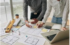
In the online world, layout equals power.
A website layout shapes experience and tells a story before words appear. It directs the eyes, controls the rhythm, and builds emotion. The design of a website decides how users feel. It can invite or repel. It can whisper trust or scream confusion.
So, let us explore ten website layouts that master the art of conversion for your web design in Melbourne.
1. The Hero-Focused Layout
A hero layout commands attention. It greets the viewer with a bold visual. A large image or video dominates the screen by keeping the message clear and immediate. The call to action sits proudly in plain sight.
Brands use this design to highlight a product or service instantly. The clarity converts, and the user feels confident. The journey begins with one powerful glance.
2. The Z-Pattern Layout
Eyes move in predictable patterns, and the Z-pattern follows that rhythm. The gaze starts at the top left, sweeps right, then drops diagonally, and finishes at the bottom right. This layout mimics natural reading flow.
It works brilliantly for pages with minimal content. Logos, headlines, images, and buttons sit at key points of the Z path. The visitor glides through the content without friction.
In short, the Z-pattern creates balance and ease required for your web design in Melbourne.
3. The F-Pattern Layout
The F-pattern suits information-heavy web designs in Melbourne. Blogs, news sites, and online magazines thrive with it.
Readers scan in the shape of an F. The eye tracks across the top, then drops and scans shorter lines below. The F-pattern keeps users engaged without being overwhelmed. It delivers information in digestible chunks. The layout leads the visitor toward deeper exploration and eventual conversion.
4. The Grid-Based Layout
Order brings comfort. A grid-based layout provides that structure. It divides content into neat squares or rectangles, while each section holds equal weight and rhythm. This design thrives on precision. It creates harmony across images, icons, and text blocks. The alignment soothes the eye. The balance keeps visitors engaged.
E-commerce stores adore grids. Products line up with clarity and elegance. Shoppers browse with ease, as choices feel organised and simple.
5. The Single-Column Layout
Simplicity often wins, and a single-column layout embraces that truth. The content flows vertically down the page. One path. One direction. No distractions.
This layout enhances storytelling. The reader scrolls smoothly through information in a pace that feels natural and calm. Each section reveals something new.
Mobile users adore this design. It adapts perfectly to small screens with sharp focus. Every element has space to breathe.
When a message must stay undiluted, a single-column layout delivers. It holds attention through clarity and flow.
6. The Split-Screen Layout
A split-screen layout grabs attention through contrast. Two halves share the page equally. Each side tells its own story. It may show a product on one and details on the other. It may display a choice between two paths.
Many brands use this layout to present dual offers—a men’s and women’s section, a product and its story, or a before and after. The symmetry feels fresh and bold. This layout shines on modern monitors and large screens. It delivers impact through balance and contrast.
7. The Card-Based Layout
Cards make information digestible. It holds an image, a title, and a short description. Social platforms use this layout constantly—Pinterest, YouTube, and many news sites. The card format encourages exploration, enabling users to click freely without commitment.
The card-based layout converts because it feels interactive. It lets users explore at their own pace. Each card becomes a doorway to discovery.
8. The Asymmetrical Layout
Perfection can feel predictable, so the asymmetrical layout breaks that pattern. It bends balance without losing control. The design plays with uneven shapes and unexpected spacing. This style draws the eye across the page and keeps your visitors intrigued. The irregularity also sparks curiosity.
Modern brands use this layout to appear bold and creative. It suggests confidence and whispers rebellion against the mundane.
In a nutshell, asymmetry converts through intrigue, making visitors linger longer to explore. And the longer the engagement, the better the connection. Connection leads to conversion.
9. The Magazine Layout
The magazine layout blends visual energy with textual depth. It mirrors the design of glossy print magazines. Large images, bold headlines, and stylish typography define the look. This format suits content-rich web designs in Melbourne. Lifestyle blogs, digital publications, and creative portfolios embrace it.
The magazine layout transforms reading into experience. It adds theatre to information, making readers stay, click and convert.
10. The Storytelling Layout
A storytelling layout uses design to narrate a journey. The visuals, text, and motion guide users step by step. Unfolding like a film, each scroll reveals the next scene. Brands that rely on emotional connection thrive with this layout. Nonprofits, luxury labels, and lifestyle companies love it.
Storytelling converts because it humanises digital space. It makes users feel part of the brand’s mission.
The Psychology Behind Layouts
A layout is not only art. It is psychology in motion. Every line and margin speaks to the subconscious. The brain seeks patterns. It craves order yet delights in surprise.
Layouts harness these instincts. A balanced grid satisfies logic. An asymmetrical design excites curiosity. A storytelling flow triggers emotion. Each structure manipulates the human mind in subtle ways.
Conversion depends on emotion before reason. Visitors rarely buy because of logic. They buy because something feels right. A good layout creates that feeling.
Final Thoughts
A website layout is more than a visual arrangement. It is a strategy that influences attention, emotion, and decision. And it holds the power to transform a casual visitor into a loyal customer.
So, if you wish to ensure your website features the most fitting layout, consider seeking an experienced professional like Make My Website. They know that the best layouts mix art with intention. Therefore, they respect human behaviour while evoking curiosity through your web design in Melbourne.
Call them right away and see where it takes you. Good luck!